
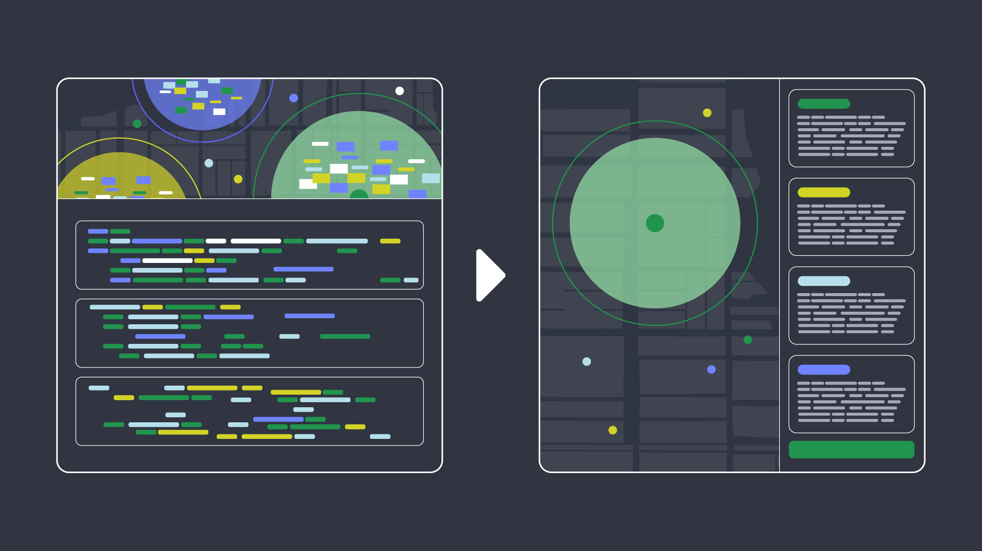
A few months into designing Envoy Response, I had an experience that changed how I thought about the product.
One afternoon, I was in the office when a few of us started to smell smoke. At first it was faint, but the smell kept getting stronger. I looked toward the kitchen, then out the window, trying to figure out where it was coming from. No visible smoke, no alarms, no one knew where the smell was coming from. Nothing looked wrong, but the smell kept getting stronger.
Then my phone buzzed. An emergency notification told us to evacuate and head to the muster point, and every screen in the office switched to the same message.
That was the moment it clicked: this was exactly what I had been designing for.
The message I received was simple. But I knew getting it to me wasn't. As I grabbed my bag, I couldn't stop thinking about the other side of it. What decisions had the admin been making while I was standing there waiting? And had we made those decisions easy enough?
In an emergency, every extra decision has a cost. The goal is to reduce the number of things someone has to figure out before they can act.
That became the lens for everything I designed next.
The threat dashboard: don't make admins interpret a cluttered map
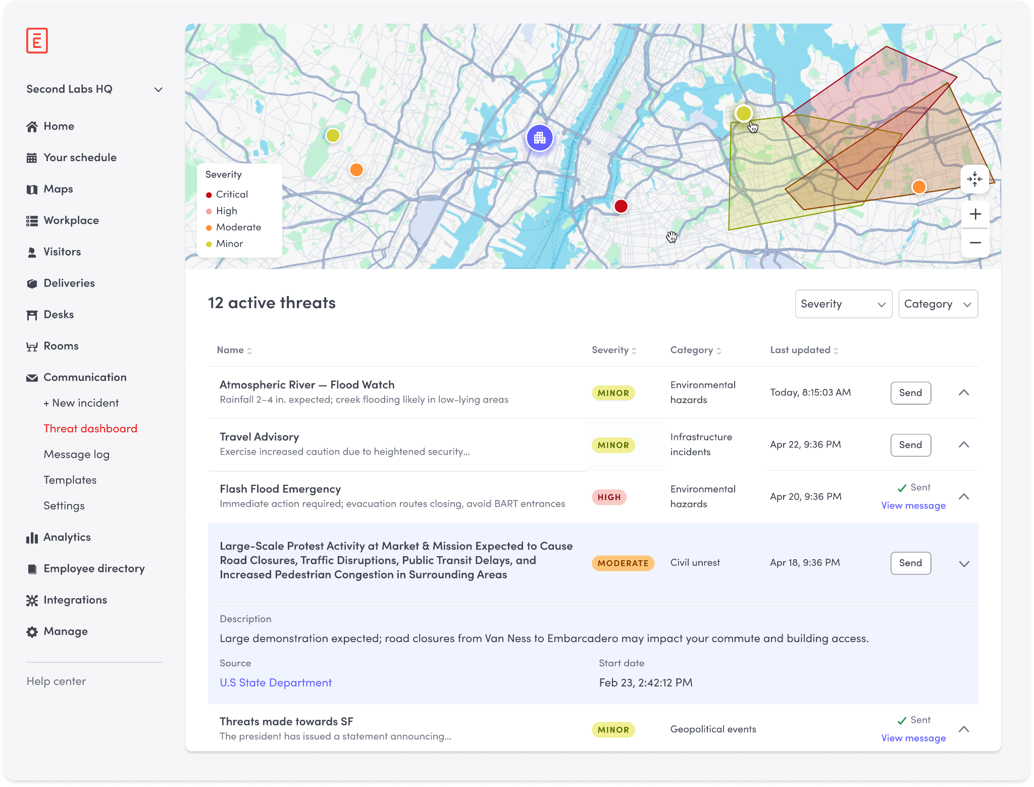
The older version had a map on the top half of the screen and a threat list below it. Besides being able to zoom in and out, you couldn't move around freely. If you clicked a threat on the map, the detail panel opened below the fold where at times you couldn't see it, making the whole thing feel disjointed. Nothing was technically broken, but every extra click, every moment of confusion has a real cost.
In the redesign, I made the map expandable and fully pannable so admins can see threats across a larger area and understand what's happening around them and not just a cropped section of it. The threat details live in a panel on the right, so you can see the map and a full threat summary at the same time without losing your place or scrolling. The information is all there, and you don’t have to search for it.
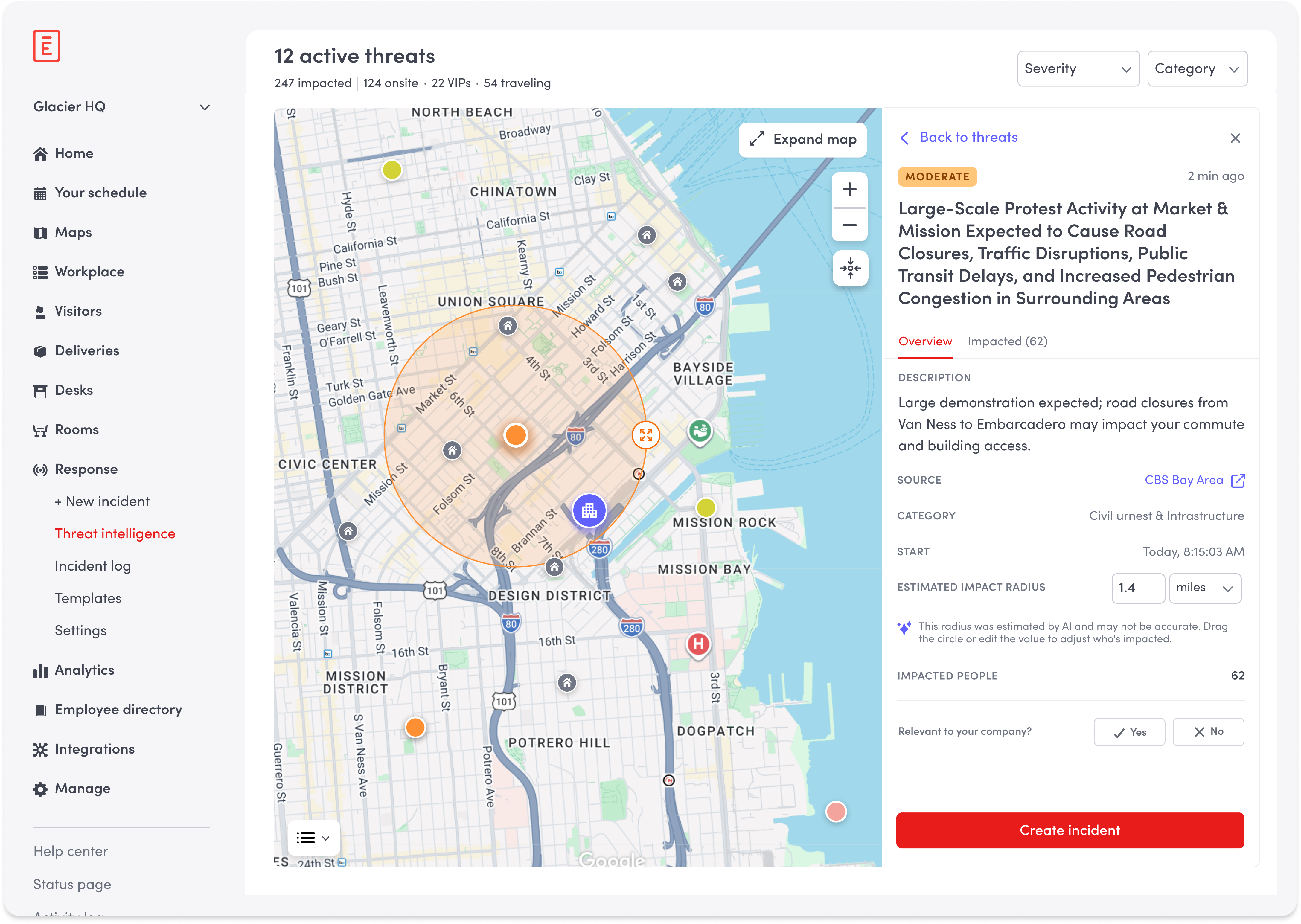
I also had to decide what not to show. Default maps contain a lot of information. Landmarks, parks, shops, street labels, and transit stops, all competing for attention. I tried using the map’s preset controls to reduce that density, but I couldn’t find the right balance. Too much felt cluttered and too little removed context that could actually matter during an emergency. I decided to take a different approach. I put together a prioritized list of landmarks that actually matter in a crisis like hospitals, transit hubs, major infrastructure, reviewed it with our PM, and worked with engineering to customize the map so only those appeared.
The goal wasn’t simply to show less. It was to make sure the things we did show were actually useful.
That same thinking applied to the threat pins. When many threats appear in the same area, individual pins quickly become hard to scan. I added clustering so nearby threats collapse together as you zoom out and separate again as you zoom in.
Color was part of that decision too. My first instinct was to keep clusters neutral, but the team preferred showing the highest severity color inside each cluster. After thinking it through, I agreed. An admin shouldn't have to zoom in just to discover something critical is there. It made me realize that reducing noise doesn't always mean showing less. It means showing the right thing at the right moment.
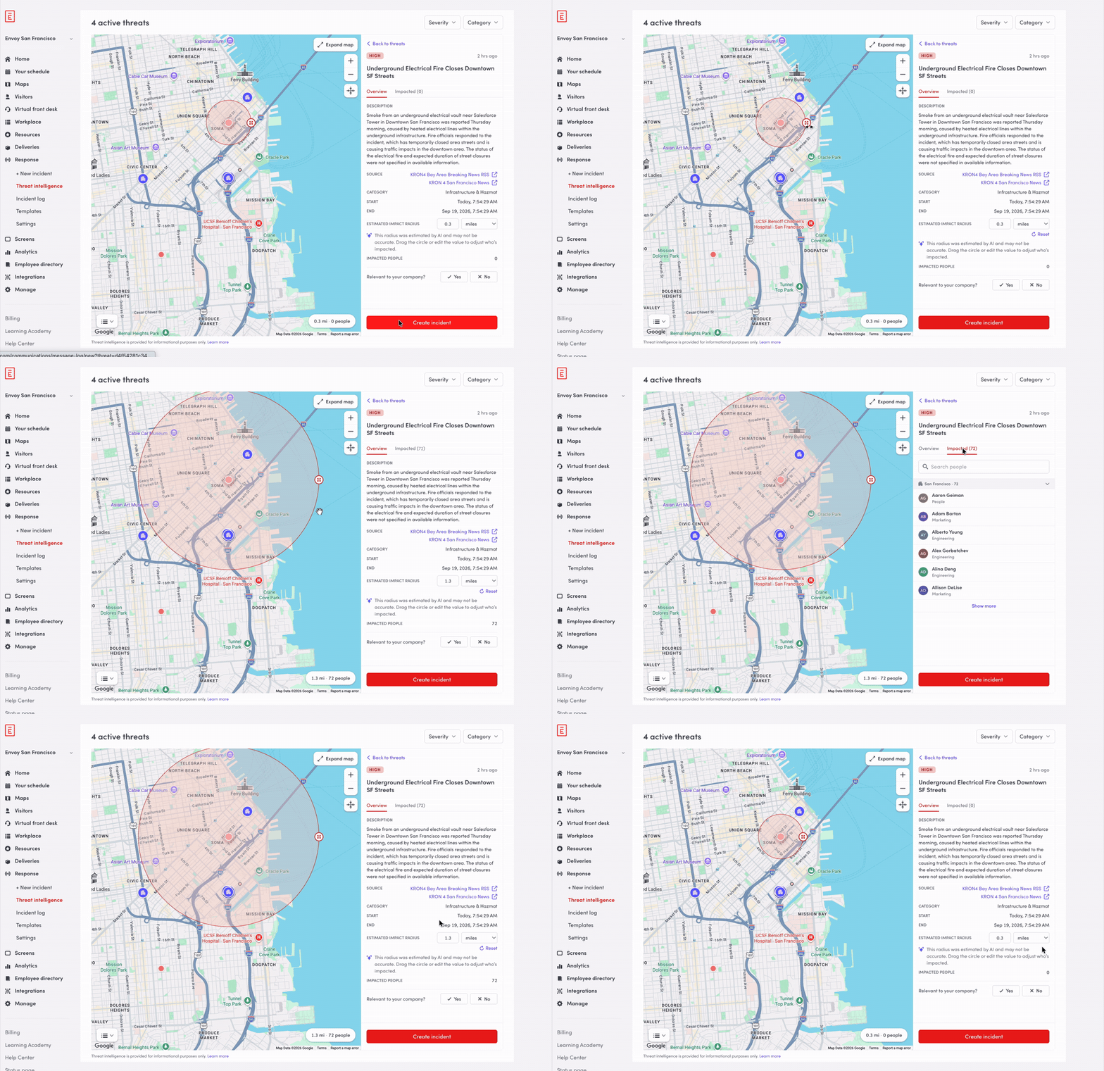
The radius was a similar story. AI gives the admin a starting point by estimating who might be affected, but an emergency rarely fits neatly inside a circle. These situations are unpredictable, and someone just outside the radius could still be close enough to matter. The radius is adjustable, and as it changes, the details panel updates in real time to show exactly how many people are now in the affected area. The system gives the admin a strong starting point, but they can still use their own judgment and make a final call.
Preselected recipients: don't make them figure out who to reach
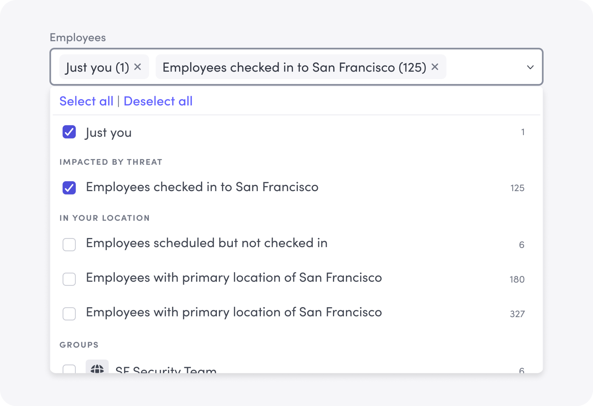
After the fire evacuation, I spoke with Caitlin Kamm, our Head of People, who had managed the evacuation. The fire alarms never went off. She only found out there was an emergency when a teammate pulled her out of a meeting booth, and her first thought was everyone who might be in a meeting or wearing headphones with no idea anything was happening.
"In the moment, I remember being overwhelmed by needing to search or filter or make any decision at all outside of getting everyone to safety."
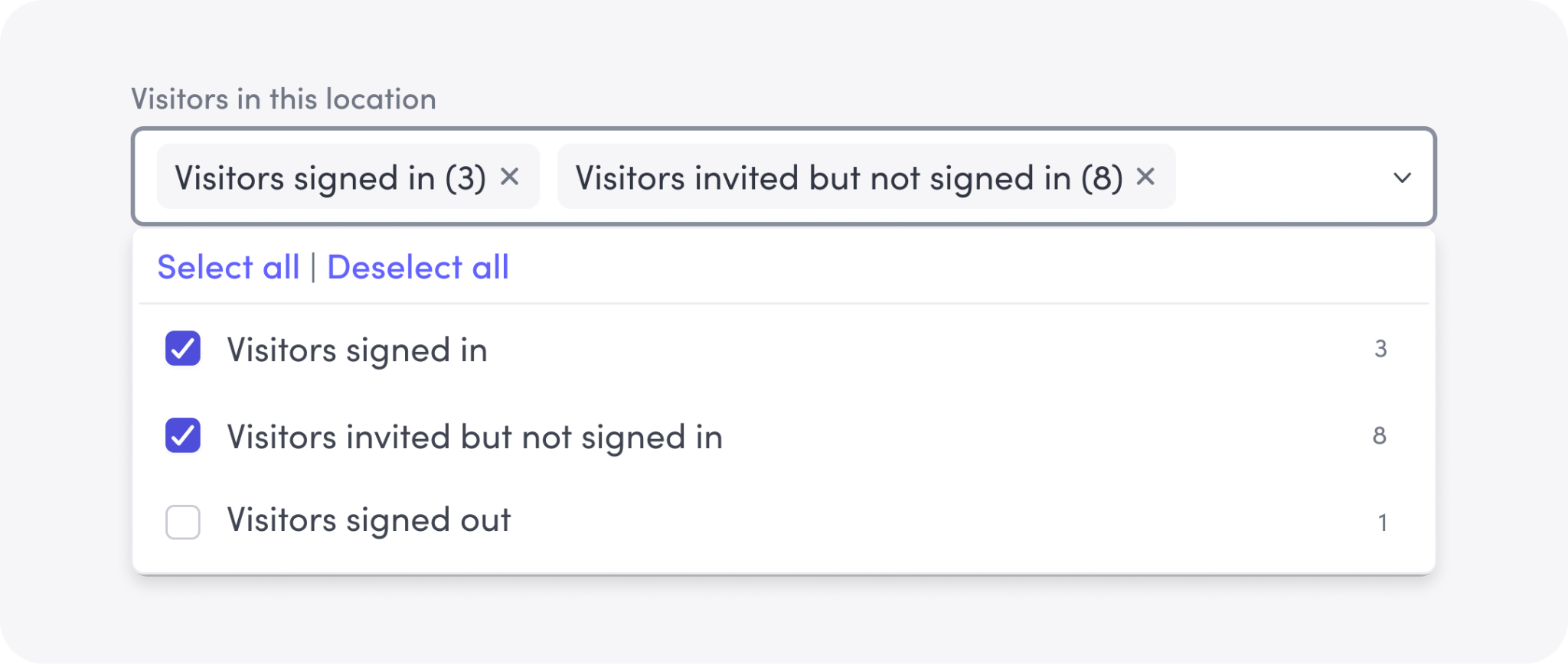
That conversation shaped how I redesigned recipient selection. Instead of asking admins to build an audience from scratch, we preselect the most relevant groups and organize them into clear categories: people impacted by the threat, others at the location, and visitors. The right people are already in the list before you've had to think about it.
What this comes down to
In design, we talk a lot about reducing friction. For emergency tools, that's not optional. It's the whole job.
When someone opens Response, they're not evaluating the product. They're relying on it. Every unnecessary decision, who to notify, whether a threat is relevant, what to do next, creates hesitation. And in an emergency, hesitation has real consequences.
Designing Response made me more deliberate about every element on the screen. Does this help someone act faster, or is it just adding noise? That's the weight that sits behind every decision.
If you enjoy working on solving problems like this with a fun, collaborative team, we’re hiring. Check out our open roles.