
The evolution of the Envoy logo
Starting at the beginning
Our logo mark takes its inspiration from an abstracted visitor’s badge. Various designers have iterated upon it over time, but the concept has been consistent. Although now we have products beyond the front desk, its equity and recognition remain, paying homage to our roots — visitor registration.
We considered leaving our logo untouched. It’s well-recognized within the workplace industry and we didn’t want to change for the sake of it. However, our logo felt lightweight and thin when sitting with others (think social proof on another company’s website, or on a sponsor slide in a deck). It was receding and we were getting lost in the background. Additionally, when small, especially on colored backgrounds, the legibility was low. But that wasn’t all — the rest of our brand was getting a facelift and it was necessary to ensure that our logo’s personality felt cohesive. With a refresh, we knew we’d be able to maintain its recognizability while addressing these concerns. It was time for a change.

Constructing the details
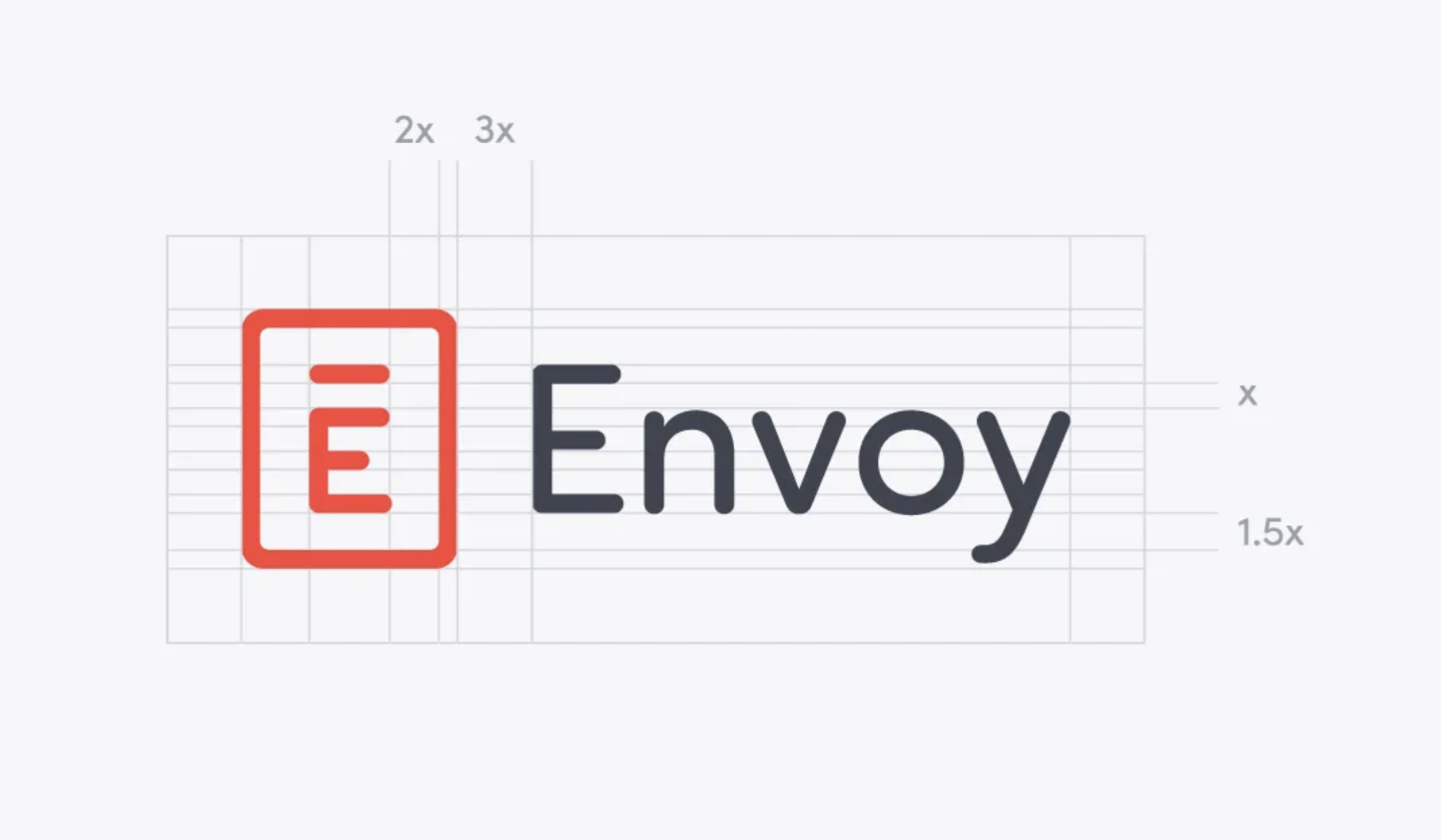
The weight overall is quite a bit thicker now, elevating and grounding the logo. We explored a wide variety of faces for the base, but ultimately chose Sofia Pro Soft — the rounded variant of our new brand font, Sofia Pro—for its welcoming and confident characteristics. While we considered moving to its sans serif family alternate within the wordmark as well, it was more important to retain the softness of the current logo.
After the font had been selected, we dove into the finer points of customizing the letterforms. By shortening the crossbar of the “E” and selecting a stylistic alternate for the “y,” it allowed for an emphasis of the humanistic disposition. Optical consistency was achieved by utilizing a narrower variation of the capital “E” within the mark, and the measurement between it and its macron were used as the basis for proportions of spacing and sizing throughout.
Moving into the next chapter
While the changes may appear small at first glance, the consequences are substantial. We built on what was working, retained perception, and elevated our aesthetics to lead us into the next phase of our brand’s history.
Read more

With more folks sending personal packages to the workplace, having a sound mailroom management system in place is key.

Workplace security is critical to the future of your business. Learn why it matters, what threats to watch for, and how to strengthen your workplace security plan.

Searching for a visitor management solution? Learn what to look out for and how to choose the best tech for your team.

Managing your space well doesn’t have to be difficult. But if you want to be successful, you need the right approach.

A well-run workplace can set your team up for success. Learn why workplace management matters and how to do it right.